These creations come to life through the combination of your creative vision and our craftsmanship…
Pastel palette and synergies among collections
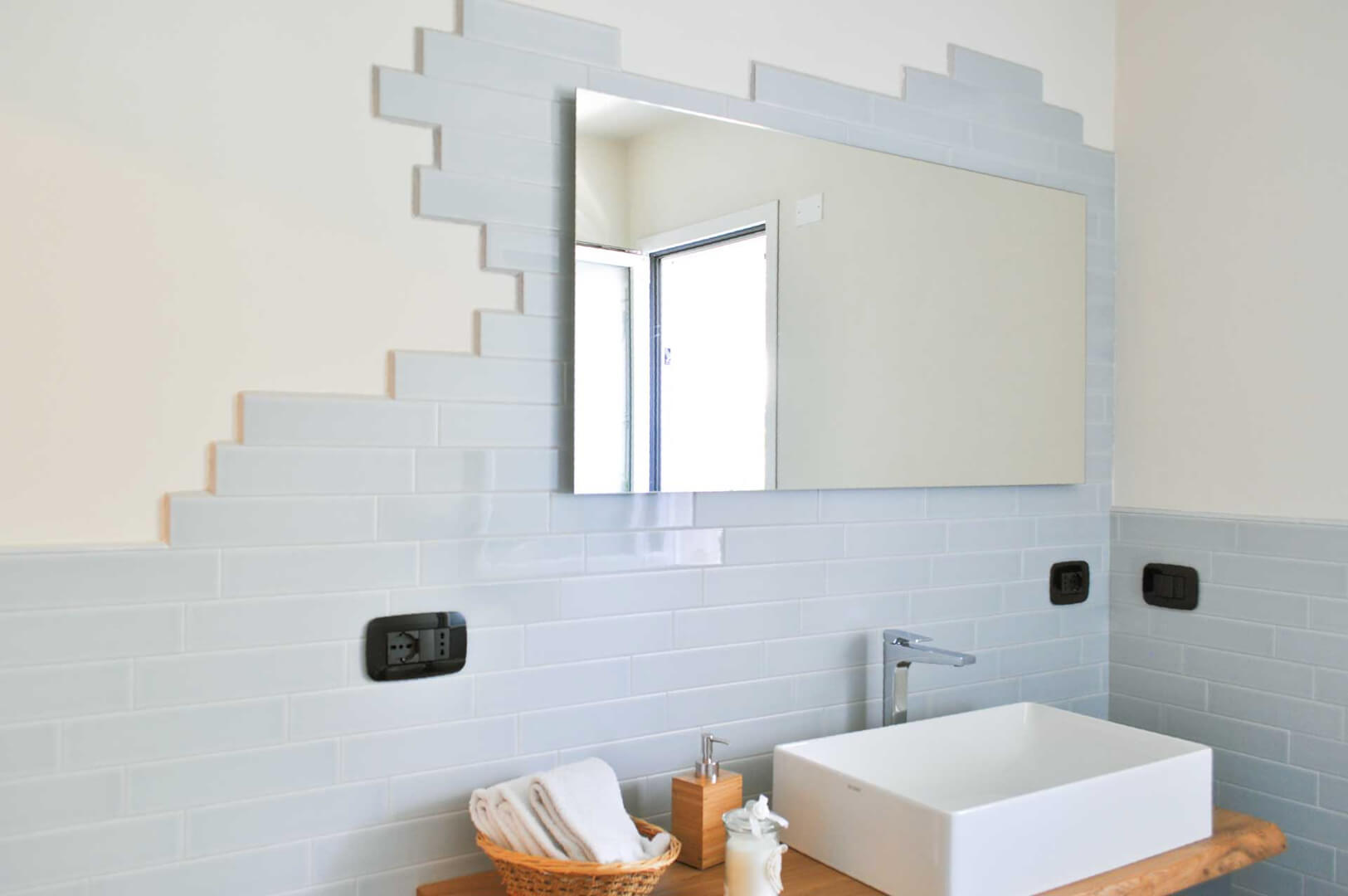
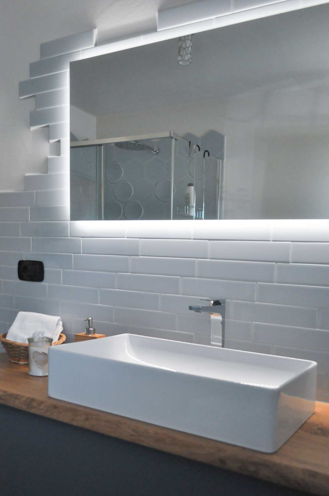
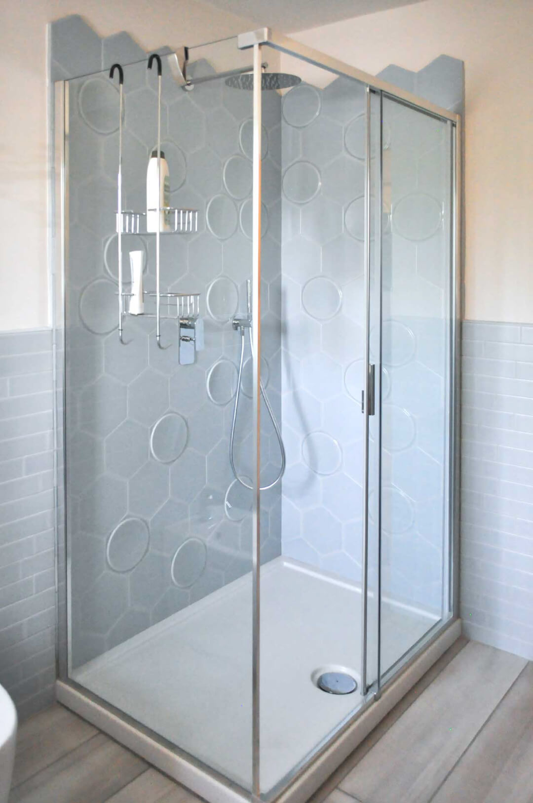
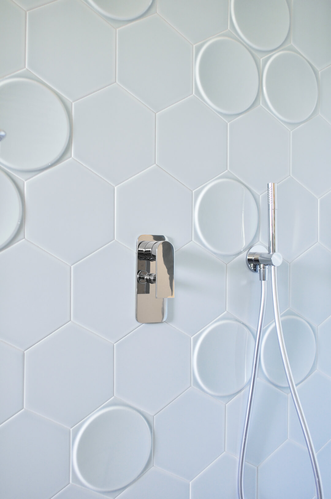
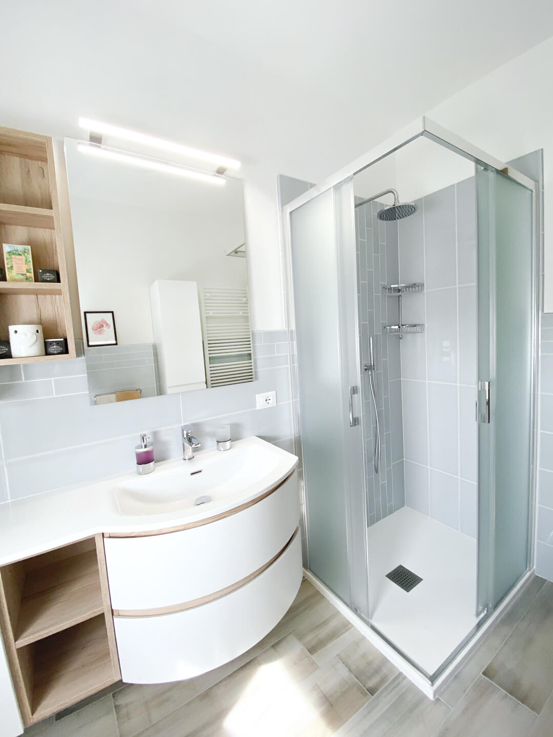
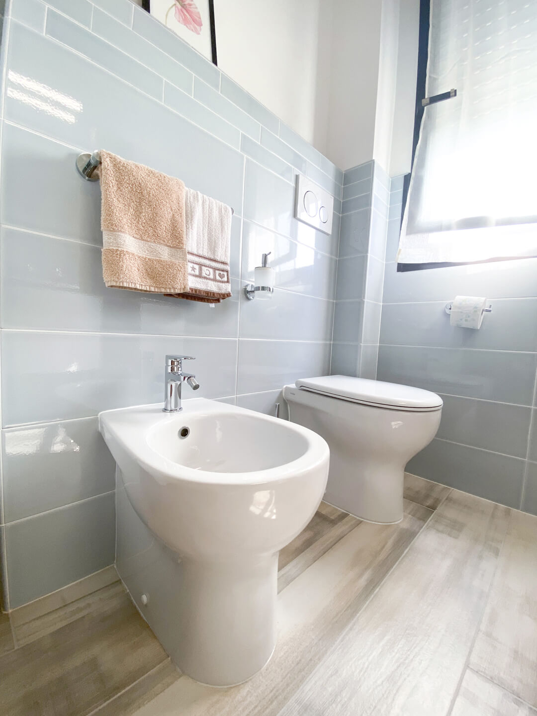
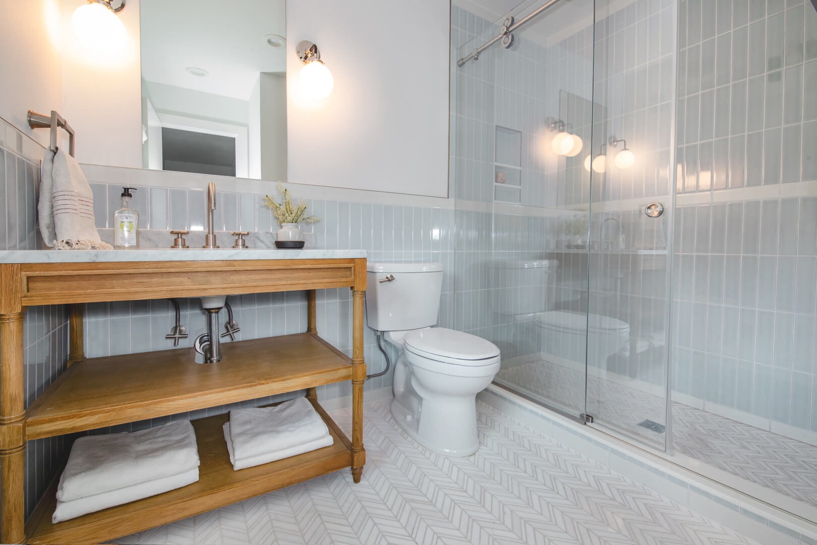
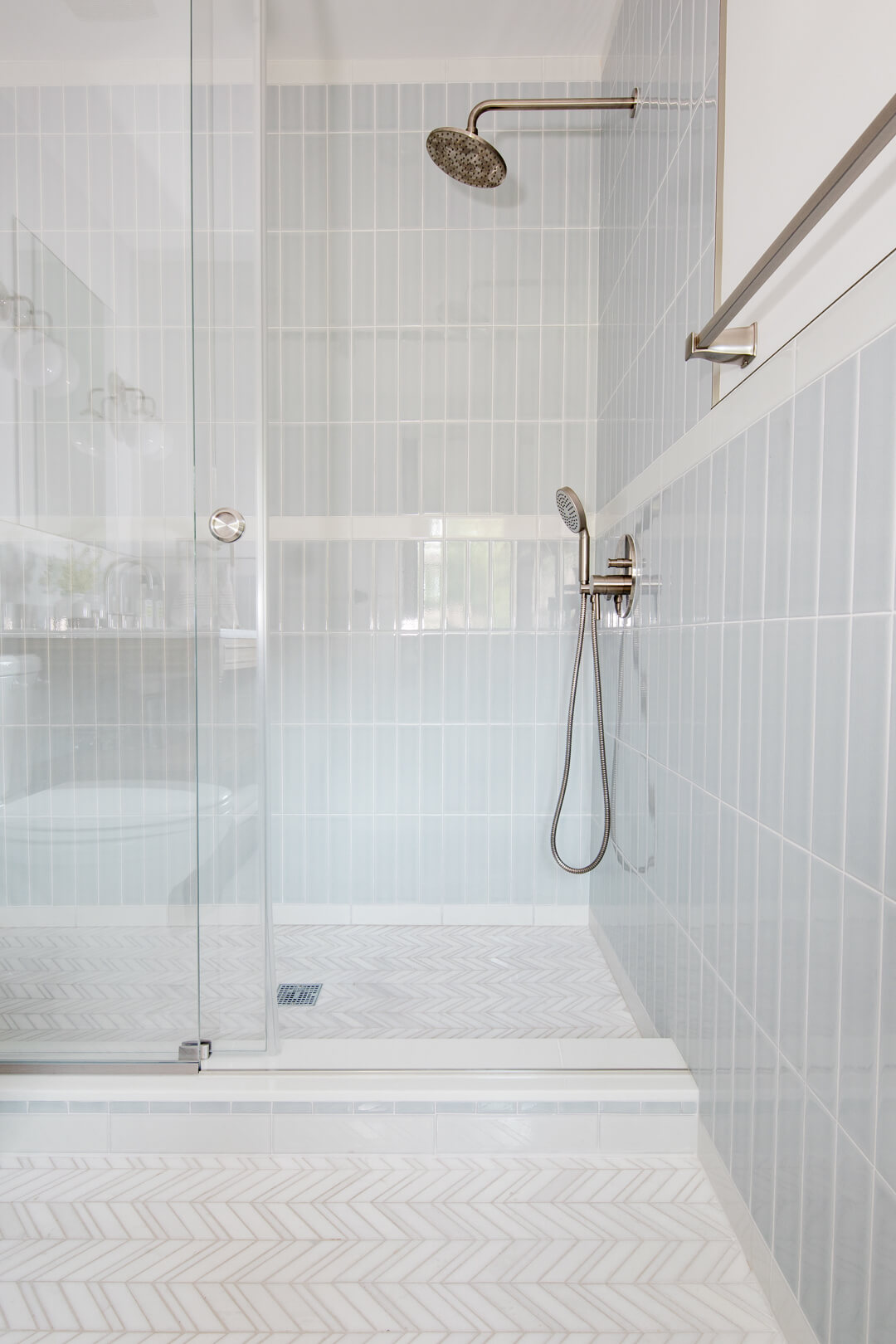
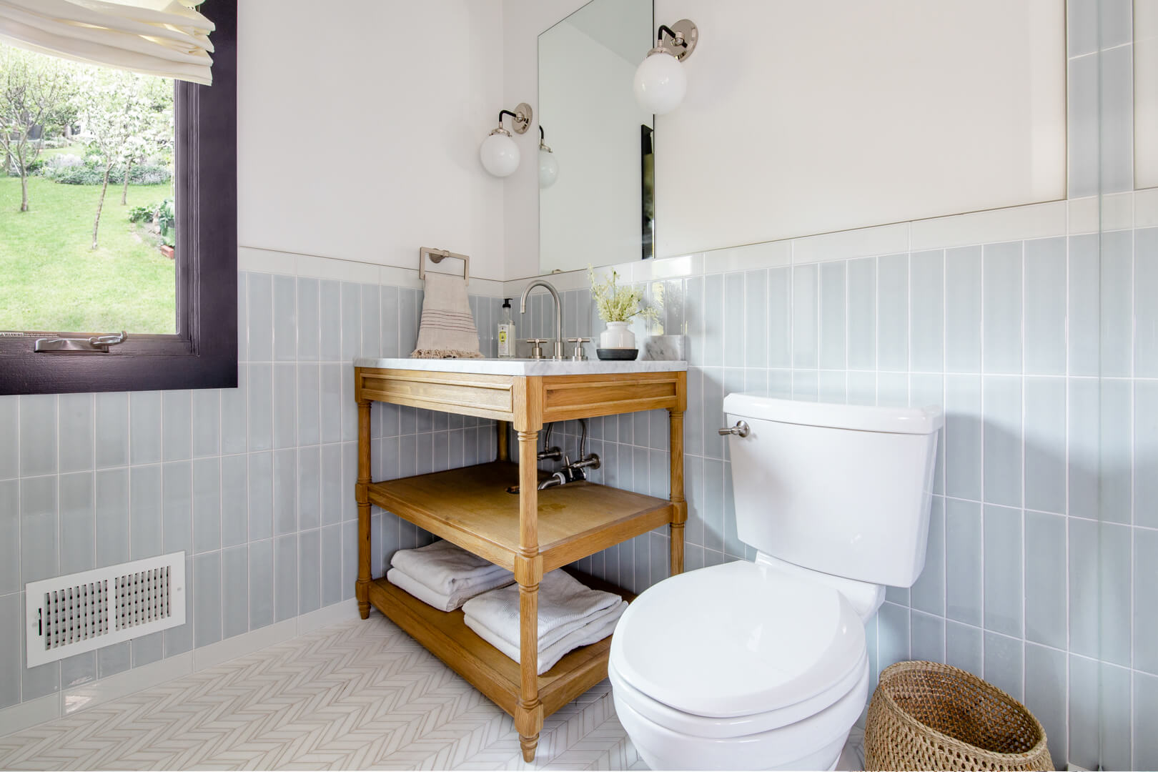
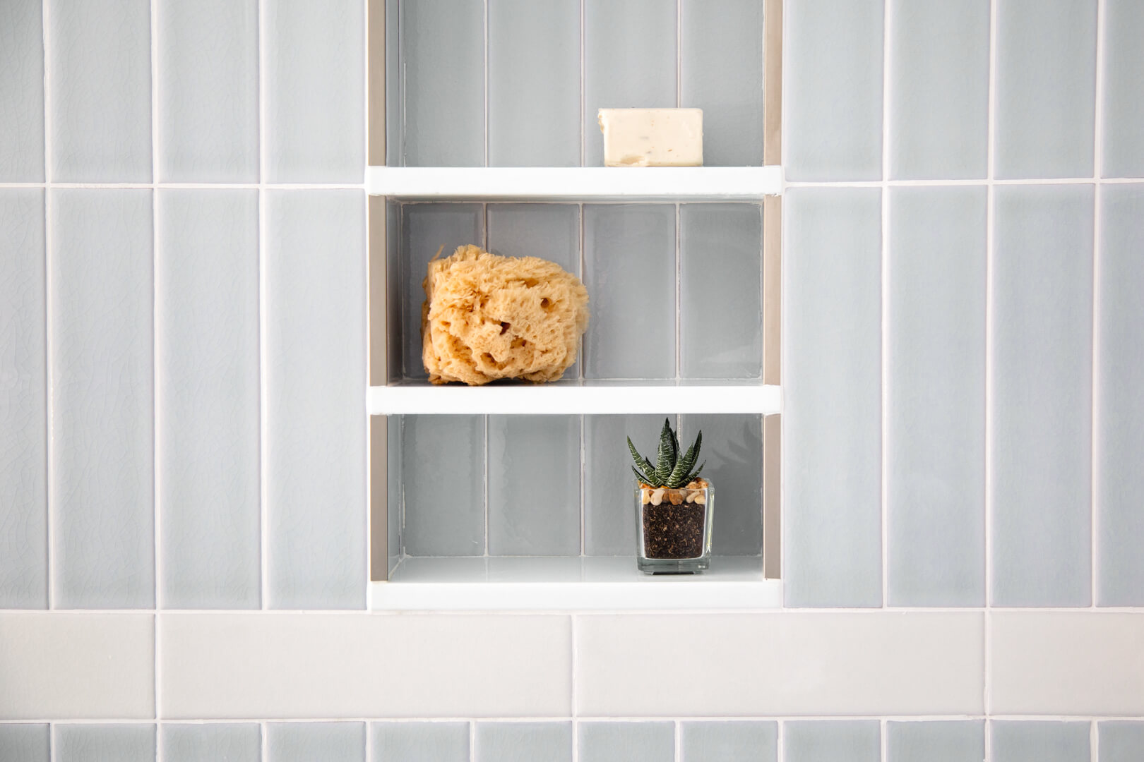
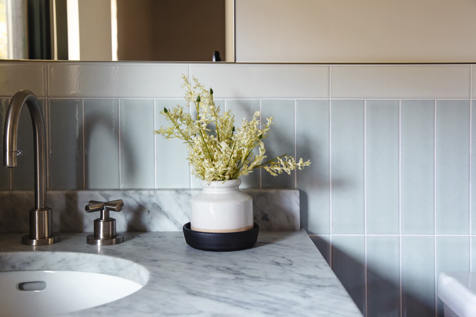
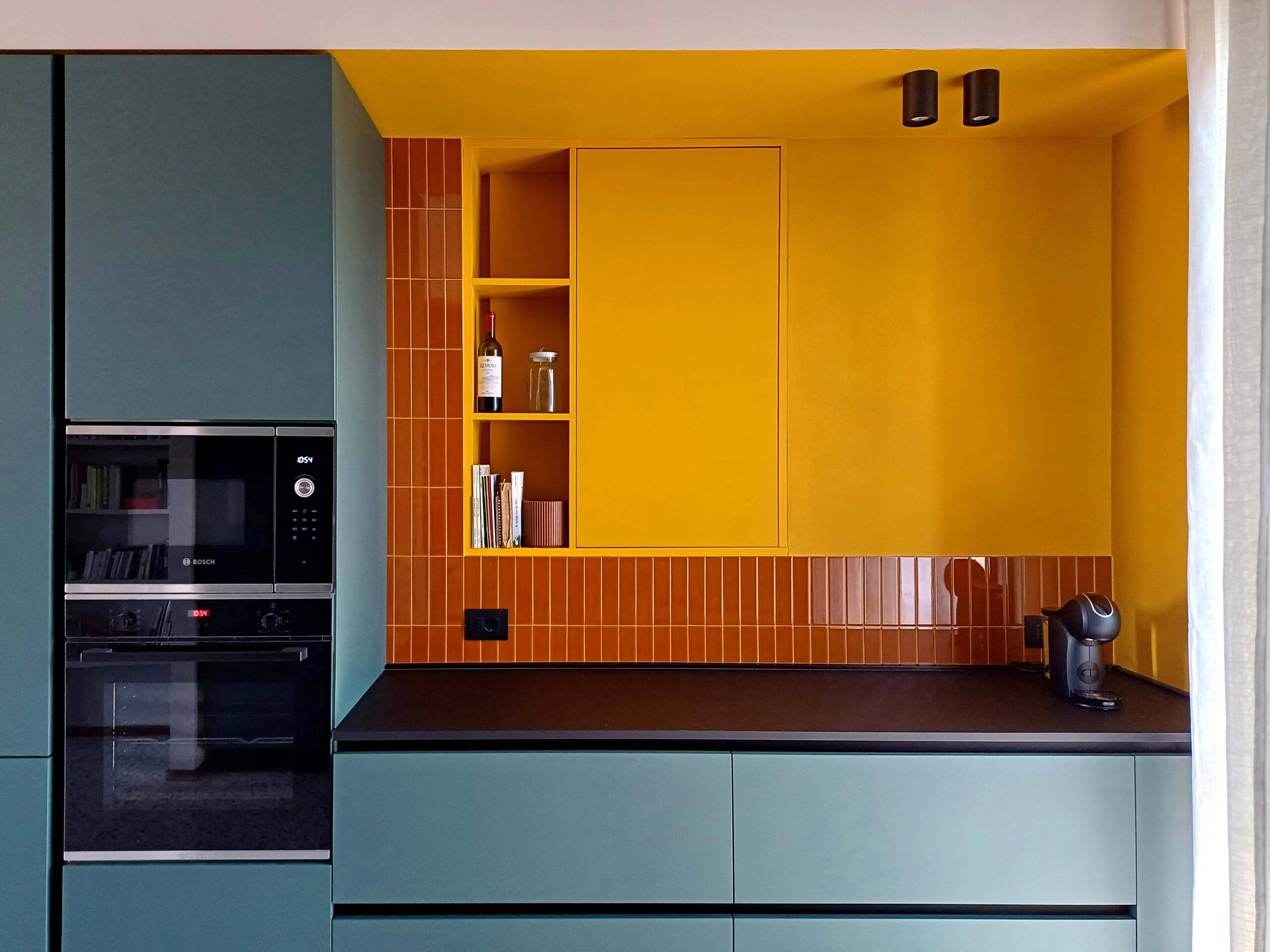
The theme we want to explore this month is a must of our company: SYNERGY AMONG COLLECTIONS! The concept of SYNERGY has a very important value to us, because matching collections expresses versatility and creativity. We love to give you the widest choice in terms of shapes, sizes and surface finishes (matt, glossy, crackle, etc…), even picking just one colour… Isn’t it amazing?! In this way, even a single-colour space can be enriched by a smart combination of different items! Here you are 3 examples of settings designed in “synergy”, using the colour you have appreciated the most, in the latest months: the Aqua colour, a pastel blue, neutral and relaxing, which has become the new gray!
